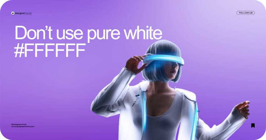
When it comes to professional graphic design, every pixel matters. One of the most common mistakes designers make is using pure white (#FFFFFF) as a background or element color. While it might seem clean and minimal, pure white can actually strain the eyes, create harsh contrast, and reduce overall visual comfort.
Here's Why It Matters:
-
User Experience (UX): As a leading UI/UX design agency, we’ve learned that user comfort is key. Softer whites (#F8F8F8, #FAFAFA) are gentler on the eyes and offer a more polished look.
-
Visual Balance: In web and branding design, balance is everything. Pure white often clashes with other design elements, especially when used next to bold colors or deep blacks.
-
Professional Aesthetic: Brands that use nuanced tones appear more modern and thoughtful. That’s why top branding and digital marketing companies avoid flat #FFFFFF in favor of warmer or cooler shades of white.
Final Thoughts
At Designer Mindz, we believe that powerful design lives in the details. From website development to digital branding and social media creatives, we ensure every color is chosen with purpose.
✨ Looking for a creative agency that thinks beyond the obvious?
Let’s build something beautifully balanced together.
🔗 Visit us: www.designermindz.com


